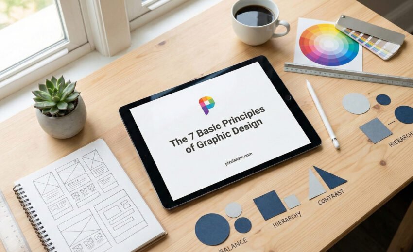
Master the 7 Basic Principles of Graphic Design: A Beginner’s Guide
Have you ever looked at a design and felt that it just “looked right,” even if you couldn’t explain why? That feeling isn’t magic—it’s science. It comes from adhering to the basic principles of graphic design.
Whether you are designing a logo for a client on PixelAnam, creating social media graphics, or building a website, understanding these core rules is essential. Graphic design is not just about making things look pretty; it is about effective communication.
In this guide, we will break down the fundamental principles that will take your work from amateur to professional.
1. Balance
Balance provides stability and structure to a design. It refers to the distribution of visual weight in an image. Think of it like a seesaw; you don’t want one side to be significantly heavier than the other, or the design will feel “off.”
Symmetrical Balance: Elements are evenly divided on both sides of a central axis. This creates a formal, classic look.
Asymmetrical Balance: Using different elements with similar visual weights (e.g., one large image on the left balanced by a block of text on the right). This feels more modern and dynamic.
Pro Tip: Don’t be afraid of white space. It helps balance your design and gives the eyes a place to rest.
2. Alignment
Alignment is what creates a sharp, ordered appearance. It ensures that no element is placed on the canvas arbitrarily. When elements are aligned, they create a visual connection with one another.
In Western culture, we naturally read from top to bottom and left to right. Using left alignment for text is usually the safest bet for readability, while center alignment works well for headlines. Proper alignment makes your design look polished and professional.
3. Hierarchy
Visual hierarchy is one of the most critical basic principles of graphic design. It tells the viewer where to look first. You can achieve hierarchy through:
Scale: Making important elements larger.
Color: Using bright colors to highlight key information.
Typography: Using bold or different fonts for headlines versus body text.
Without hierarchy, your design is just noise. You must guide the viewer’s eye to the most important message first.
4. Contrast
Contrast is the secret sauce that makes a design “pop.” It occurs when two elements are strictly different. The most common forms of contrast are dark vs. light, large vs. small, and thick vs. thin.
Why use it? Contrast creates emphasis and impact. If your background is white, your text should be black or dark grey to ensure it is legible.
Example: A bright red “Call to Action” button on a clean white website background.
5. Repetition
Repetition strengthens a design by tying together individual elements. It helps create association and consistency.
If you are building a brand identity, repetition is vital. Using the same color palette, font styles, and logo placement across all pages of a website (like here at PixelAnam) creates a cohesive brand experience. It shows the user that everything belongs to the same package.
6. Proximity
Proximity creates a relationship between elements. It simply means that things that are related should be grouped together.
For example, on a business card, the phone number, email, and address should be grouped together in one visual block. If they were scattered in four different corners, the design would feel cluttered and confusing. Proximity organizes information and reduces visual clutter.
7. Color and Space
While often treated separately, color and space wrap up the fundamental principles.
Color: Dictates the mood. Blue implies trust, red implies urgency, and yellow implies happiness. Always choose colors that align with the message.
Negative Space (White Space): This is the area between or around elements. It is not “empty” space; it is an active design element. It defines the boundaries of positive space and brings balance to the layout.
Conclusion
Mastering the basic principles of graphic design takes time and practice. By focusing on balance, alignment, hierarchy, contrast, repetition, and proximity, you can create visuals that are not only beautiful but also functional and effective.
Ready to start your next project? Apply these rules and watch your designs transform.